Welcome to the GeekShot Photo Exclusive Series. This will be a weekly post featuring cool, interesting, or just plain awesome moments we have captured during San Diego Comic-Con. Each week we’ll post a photo by Beth or James of GeekShot Photography. We may include a short story about the photo, but sometimes we’ll just let the photo speak for itself.
About These Photos
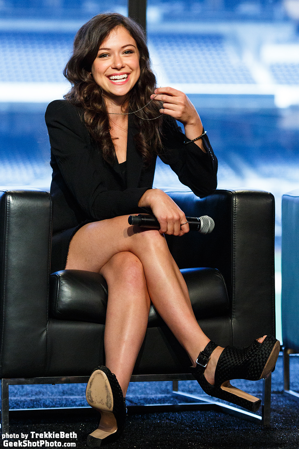
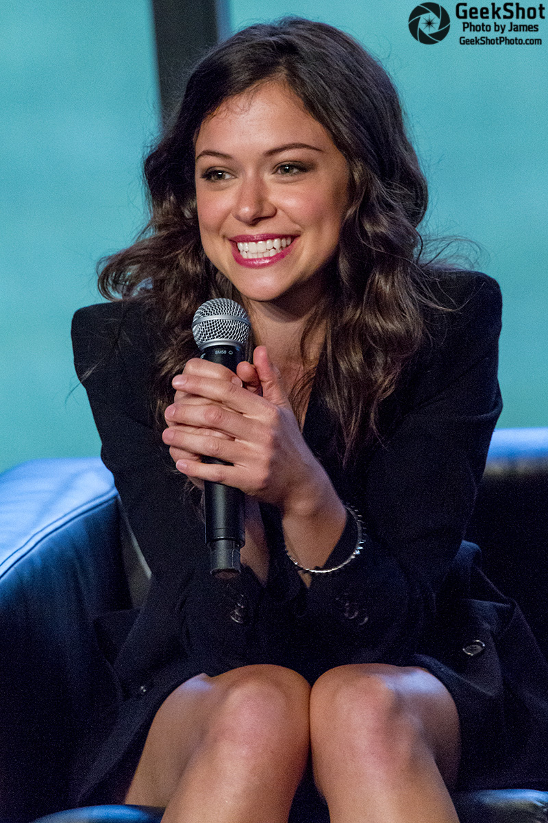
Tatiana Maslany at the Orphan Black Conversation for a Cause at the 2013 Nerd HQ.
This week you get a double dose of Tatiana Maslany with a photo from both Beth and I. We’ve said it before and it still applies, this first ever Orphan Black panel was one of the best we’ve ever seen. It was a highlight of the entire convention that year for both of us. As both the photos show, Tatiana smiled and laughed a lot. She has an incredible amount of talent and the interactions with her fellow cast were fun and felt genuine. If you haven’t seen Orphan Black, we highly recommend it. With season 3 coming soon (April 18, 2015) you have time to catch up on the previous two.
But enough about the awesomeness of Tatiana and the show, we’re here to talk photos and camera gear today. Take a look at both photos and you can see some fairly obvious differences. We’re only going to be talking about technical differences this time (both photos are aesthetically nice if I do say so myself). Beth’s photo is brighter, sharper, cleaner, and has a more pleasing color balance. My photo is darker, noisier, and the focus is off. What can cause so much of a difference in the same room with the same lighting and taken within minutes of each other? It’s all about the gear.
Beth used our Canon 5D Mark III camera with a Sigma 70-200mm f2.8 lens. I used a borrowed Canon 7D with a rented Canon 100-400mm f4.5-5.6. Beth had a ticket and was only a few rows from the front. I had gotten press and was at the very back of the room. With the crop sensor camera and double the reach with the lens, I was able to get almost as close of photos as Beth. But there is a big difference to being close and having the choice of how much you will zoom/crop and being forced to use the full zoom and still having to crop. Since I was farther back that meant I was also higher up, which changed the angle of the photos and how they look. With the seats of Petco in daylight in the background, Beth’s has a better balance overall. Mine has the green of the grass in shade and that made it difficult to fully get rid of the green hue. When we compared our white balance settings on the edited Raw files they were very close.
But being able to get close with the zoom didn’t make up for the other technical problems I faced. The camera I was using was 4 years old at that time. It had been used quite a bit by its owner so it wasn’t as good as it could be. Since I was using a rented lens I didn’t have time to calibrate the lens with the camera (and I’m not even sure it was an option on that camera). So even though I was focusing on Tatiana’s face/eyes it front focused and the microphone/hands are sharp. Meanwhile, Beth had a full frame camera that was only a year old and was using an adjusted lens that was only 7 months old. Factor in the better ISO capabilities of Beth’s camera and wider aperture of her lens and she was able to more easily make use of the available light. I had limited ISO options and a smaller aperture which meant I had to underexpose to keep my shutter fast enough. I was doomed to have a lesser quality photo right from the start.
Despite all this, we both ended up with nice photos. They capture the fun Tatiana was having during the panel as well as little things like her playing with her necklace. Make the best use of the gear you have and try to capture the moments that make your subject shine. Getting a technically perfect photo isn’t necessarily needed to get a great shot.
Did you get a favorite shot despite your gear? Let us know in the comments.
You can see all of the previous posts in this series here.
