Welcome to the GeekShot Photo Exclusive Series. This will be a weekly post featuring cool, interesting, or just plain awesome moments we have captured during San Diego Comic-Con and WonderCon. Each week we’ll post a photo by Beth or James of GeekShot Photography. We may include a short story about the photo, but sometimes we’ll just let the photo speak for itself.
About This Photo
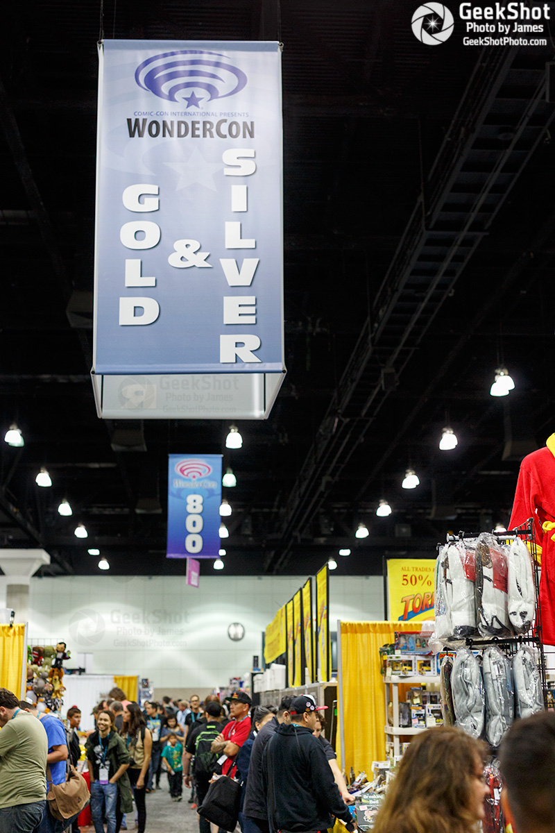
Generic convention photo #23 taken at WonderCon 2016.
Just from looking at the photo you’d only know this was taken at WonderCon because of the sign. There are so many conventions now, and so many photos are taken that they all start to look the same. So how do you make yours stand out?
The really simple answer is to go back to the basics. Make use of the rule of thirds. Have something be the focus of the shot. Use lines or repeated objects to draw the eye into the photo. These can can be a bit difficult when there are just a bunch of people and booths all mixed up together. In this photo, I chose the Gold & Silver hanging sign as my focal point. The lighting is drawing your eye into the photo, but the angle draws your eye away from the sign and to the rest of the story of the photo, which is the booths and people. However, it’s usually better to use the lines to draw the eye to your subject. Generic con photos can have multiple subjects so I think it works in this case.
It will take patience, but you should wait for a decent gap in people. Photos that have random people facing directly towards the camera and/or take up a large percentage look a bit off most of the time. Let your photo have some breathing room since this is a “generic con” and not a “look what this person is doing” photo. Unless they’re people you know it’s best to keep others as anonymous as possible. Notice that the faces you can see in this photo are farther away and out of focus. I did this so you can get the feel of the show floor without any distraction.
You’ll also want to have your photo be as level as possible. Interesting angles are fine for specific objects or people, but I feel crowd shots should be as you see them. Most people don’t walk around with their head tilted so your photo shouldn’t be tilted either.
The generic con photo can be fun and interesting if you do a bit of planning and have a little patience. In my case, I need them for the multiple articles we write about badges, booths, signings, and so much more. We don’t want you to have to see the same photo time after time and I personally want the photos to look nice. Plus, you get a happy editor. [Editor’s Note: This is true]
Have you tried to get interesting generic con photos? Let us know in the comments.
You can see all of the previous posts in this series here.
This photo is copyright (All Rights Reserved) by Beth and/or James Riley of GeekShot Photography. It may not be copied, reposted, published, or used in any manner without their written permission.
