Welcome to the GeekShot Photo Exclusive Series. This will be a weekly post featuring cool, interesting, or just plain awesome moments we have captured during San Diego Comic-Con. Each week we’ll post a photo by Beth or James of GeekShot Photography. We may include a short story about the photo, but sometimes we’ll just let the photo speak for itself.
About This Photo
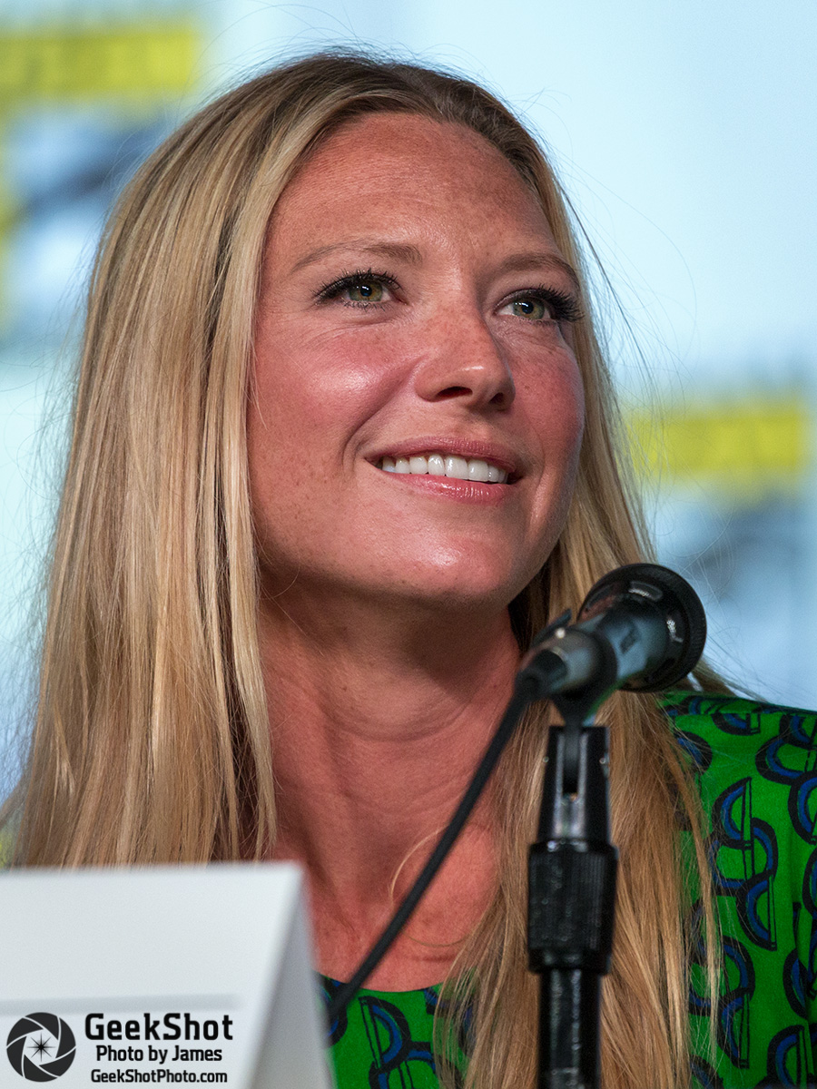
Anna Torv at the Women Kick Ass (top) and Fringe (bottom) panels during San Diego Comic-Con 2012.
Let’s call this week’s post A Tale of Two Rooms. Take just a moment to look over both photos. Try and ignore Ms. Torv for a second, which admittedly is difficult, and look at the quality of the photos themselves. Each of them was taken with the exact same camera and lens, and each had the exact same aperture and shutter speed. The only difference is the ISO setting, 1250 vs 5000. Why does the Hall H one look so much worse…not as good? Light.
The longer answer to the question is the quality, placement and strength of the light. Ballroom 20 has awesome lighting. Hall H had crappy lighting. B20 lighting is out in front of the stage and angled to light faces. Hall H lights are almost directly above the stage. Both room’s lights hang from the ceiling but B20 is a lot closer than in Hall H due to the simple fact that the ceiling is lower. With an equal amount of lighting Hall H is going to be worse for this reason alone. Another smaller part is played by the stage/background. There is a lot of white on the B20 stage with the tabletops and backdrop while Hall H has very little. The light gets reflected off white and helps fill in shadows.
But what can you do to combat the crappy lighting in Hall H? Well, first off you may notice I said it had crappy lighting? In 2014 they made some changes and it’s no longer crappy. It’s not quite up to the quality of B20 (the last time I was there) but it’s a lot better. The best advice I can give is to either be prepared to get grainy photos or spend a little extra money. I prefer sharp but grainy photos over blurry but less grainy, so plan to set your ISO higher and try not to cut your shutter speed. For those with DSLRs you may want to look into renting or purchasing one of the faster zoom lenses. For 2014 we rented a Sigma 120-300 f2.8 which allowed a bit more reach than the usual 70-200 f2.8 but kept the fast aperture. If you’re going to rent or buy, look into the options available and make a decision based on your needs. Check the weight too, because that Sigma was a monster!
What panel room do you think has great/awful lighting? Let us know in the comments!
You can see all of the previous posts in this series here.
